

The Psychology of Color | How Colors Affect Mood and Emotions
by Delwar Hussain / Last Update: September 18, 2023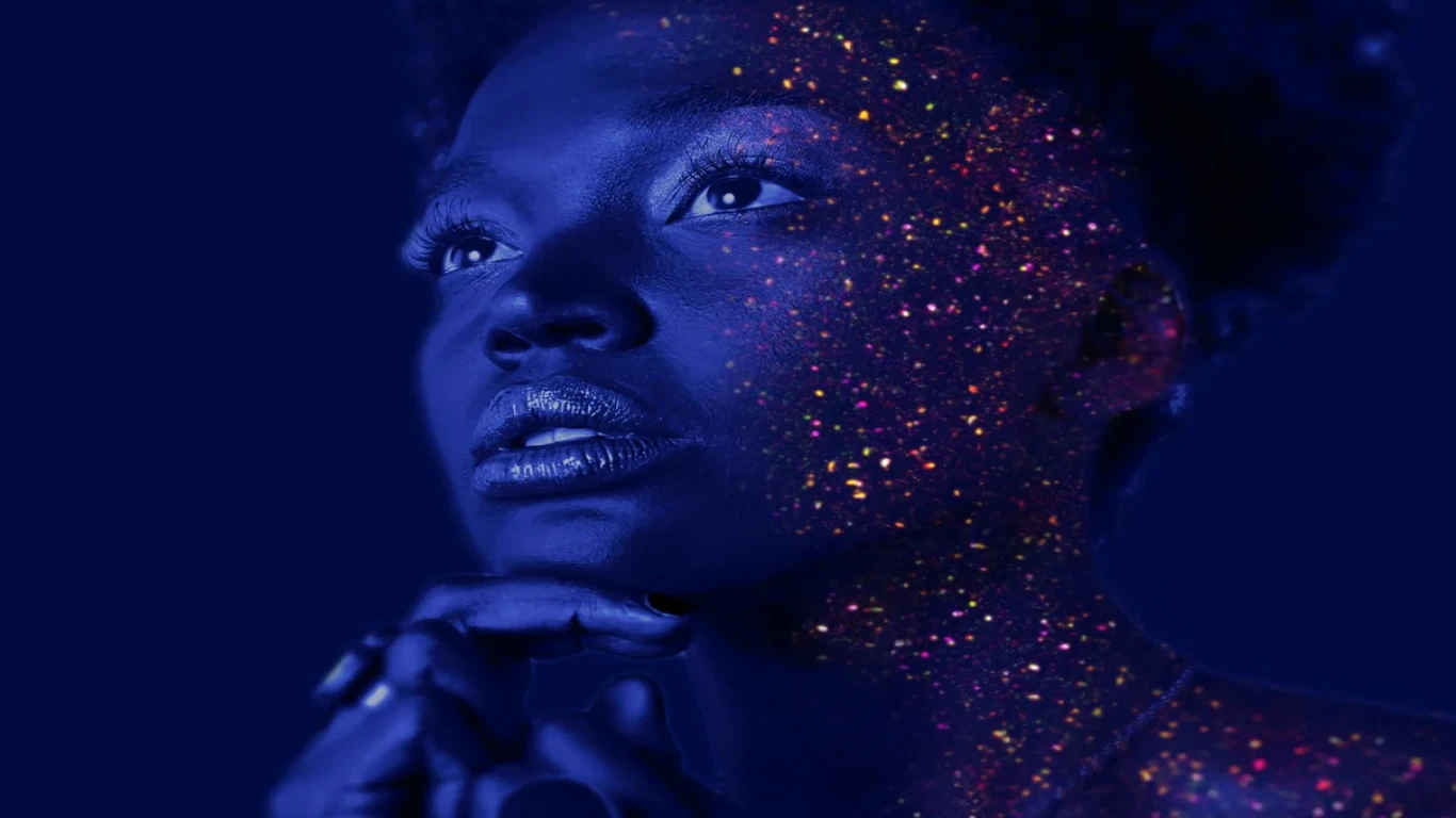
Color is a ubiquitous and powerful aspect of our visual world, and it plays a significant role in shaping our emotions, perceptions, and behavior. The psychology of color is a fascinating and complex area of study that seeks to understand how colors influence our thoughts, feelings, and actions.
Basically, Color is related congruously with the psychology of humans. Each color can have an impact on the consumer’s buying behavior and eventually helps to make the decision. Each color can evoke different emotions and responses in different individuals. As a result, color is often used in marketing, advertising, design, and art to influence and persuade people.
The psychology of color is the study of how colors affect human behavior, emotions, and perceptions. Colors can evoke specific emotions and behaviors, with warm colors like red and orange being associated with excitement and energy, while cool colors like blue and green are associated with calmness and relaxation.
Color also plays a vital role in marketing and advertising, with different colors being used to influence purchasing decisions and create brand recognition. Understanding the psychology of color can help individuals and businesses make informed decisions about the colors they use in their environment, products, and branding to elicit the desired emotional and behavioral responses.
The Science of Color Perception
The Human Visual System
The human visual system is a complex network of structures and processes that work together to enable us to see and interpret the world around us. Light enters the eye through the cornea, is focused by the lens, and reaches the retina where it is converted into electrical signals.
These signals are transmitted to the brain via the optic nerve and processed in the visual cortex. The visual system also includes various specialized cells, such as rods and cones, that allow us to see in different lighting conditions and perceive color. Overall, the human visual system is a remarkable feat of biology that allows us to experience the world in vivid detail.
The human visual system’s ability to perceive color is an intricate process that involves various structures and cells working in conjunction. The retina contains specialized cells called cones that are responsible for detecting color.
There are three types of cones, each sensitive to different parts of the color spectrum. When light enters the eye, it stimulates these cones, and the information is sent to the brain via the optic nerve. The brain then processes this information in the visual cortex, allowing us to perceive and differentiate between various colors.
Overall, the human visual system’s ability to perceive color is a fascinating and essential aspect of our experience of the world.
Color Perception and How it Works
Color perception is the process by which the human visual system interprets the wavelengths of light that enter the eye and creates the sensation of color. The retina contains specialized cells called cones that are sensitive to different parts of the color spectrum. When light enters the eye, it stimulates these cones, and the information is sent to the brain via the optic nerve. The brain then processes this information in the visual cortex, creating the sensation of color.
The perception of color can also be influenced by factors such as lighting conditions, contrast, and individual differences in color perception. Overall, color perception is a complex and fascinating aspect of human vision that allows us to experience the world in vivid detail.
Color plays a crucial role in visual communication and design by conveying emotions, setting a tone, and creating an aesthetic appeal. It can influence the viewer’s mood, perception, and behavior towards a product, brand, or message. Color theory and psychology are essential aspects of design that enable designers to create effective and impactful visual communication.
Understanding the Psychology of Color
Color psychology dates back to ancient cultures, where colors were associated with certain emotions and beliefs. However, it wasn’t until the 20th century that color psychology became a significant field of study. Researchers explored the relationship between color and human behavior, leading to the development of color theory and its application in various fields, including marketing, advertising, and design.
Color psychology principles involve the study of how colors affect human behavior and emotions. Color symbolism and associations vary across cultures, but certain colors have universal meanings. For example, red is associated with passion and excitement, blue with trust and serenity, and yellow with happiness and optimism.
These associations influence color choices in design, advertising, and branding, as colors can evoke specific emotions and attitudes in viewers.
How Colors Affect Mood and Emotions
Primary colors such as red, orange, and yellow are associated with real life energy, passion, and warmth. They can stimulate the viewer’s appetite, increase heart rate, and evoke feelings of excitement and urgency.
Cool colors such as blue, green, and purple are associated with calmness, tranquility, and serenity. They can lower heart rate, promote relaxation, and evoke feelings of trust and stability. Color choices in design, marketing, and branding can influence the viewer’s emotions and behaviors, making warm and cool colors essential tools in visual communication.
Complementary color schemes like Saturation and brightness can have a significant impact on emotional response to color. Highly saturated colors are vibrant and intense, evoking feelings of excitement and energy, while desaturated colors can create a sense of calmness and tranquility. High brightness levels can evoke feelings of optimism and positivity, while low brightness levels can create a sense of sadness or melancholy. Understanding the effects of saturation and brightness on emotional response can help designers create effective color palettes for different contexts and audiences.
Color and Branding
Color is a crucial element in branding and marketing, impacting consumer behavior and perception in powerful ways. Effective use of primary color palette in branding can communicate a brand’s values, personality, and mission. For example, blue is often used by technology brands to evoke trust and professionalism, while red is associated with energy and excitement, often used by fast-food chains and sports brands. Color can also influence consumer purchasing decisions, with studies showing that people make subconscious judgments about a product within 90 seconds of seeing it, with color accounting for up to 90% of the assessment.
Consistent use of color correcting across different marketing channels, including packaging, advertising, and digital media, can reinforce brand identity and increase brand recall and loyalty. This is why many brands invest significant resources in creating a distinctive color palette and ensuring that their colors are reproduced accurately across different media and outputs.
When color correcting an image or video, it’s crucial to understand the properties of light waves and how they interact with the colors in the scene. For example, if the scene is lit with warm light (yellow/orange), the colors in the scene may appear warmer than they actually are. In this case, the colorist would need to adjust the colors to appear cooler (blue/green) to compensate for the warm light.
Here are a few examples of successful color branding strategies:
Coca-Cola: The Coca-Cola brand is known for its distinctive red color, which has been a consistent element of its branding since its inception. The red color is associated with energy, excitement, and passion, which aligns with Coca-Cola’s brand values.
McDonald’s: McDonald’s is known for its bright yellow and red color scheme, which is designed to evoke energy, excitement, and happiness. The yellow is associated with positivity and optimism, while the red is associated with appetite stimulation.
Tiffany & Co: The luxury jewelry brand Tiffany & Co. is associated with its distinctive blue color, which is now known as “Tiffany blue.” This color is used consistently across all of its branding and packaging, reinforcing its luxury and exclusivity.
Spotify: Spotify’s green color palette is used consistently across all of its branding and advertising, evoking feelings of growth, renewal, and vitality. The green color is also associated with music, nature, and innovation, which aligns with Spotify’s brand values.
Apple: Apple’s minimalist branding strategy includes the use of a sleek, monochromatic color palette, consisting mainly of white, black, and silver. This clean and simple design approach aligns with Apple’s brand values of simplicity, innovation, and elegance.
These successful color branding strategies demonstrate how effective use of color can reinforce brand identity and create emotional connections with consumers.
Color Correction Techniques for Various Mediums
Color correction is the process of adjusting the color and tonality of an image or video to achieve a desired look or correct issues like white balance, exposure, and color cast. It can be done using software like DaVinci Resolve, Adobe Premiere Pro, or Final Cut Pro, among others. Color correction can be applied to various mediums such as photos, videos, films, and animations .Color in film can convey emotions, set the tone, evoke symbolism, aid storytelling, and enhance visual appeal and immersion.
Color correction and color shift in graphic design and advertising involves adjusting the colors of images and graphics to ensure consistency and accuracy across different media and outputs.
Using aesthetic choices of color in different contexts requires careful consideration of audience, design principles, and accessibility to create effective and impactful visual communication. If you want to learn how to properly do photo color correction, be sure to read this article on;
Photo Color Correction for Beginners: A Step-by-Step Guide
Here are some best practices for using color in different contexts:
Consider the audience: Colors can have different meanings and associations in different cultures and age groups. Understanding your target audience’s preferences and cultural context can help you choose the most effective color palette. Be sure to read this to learn how to attract your audience more: The Power of Photo Color Correction for Social Media | How to Make Your Posts Pop
Use color theory: Familiarize yourself with color theory, including complementary, analogous, and monochromatic color schemes, to create harmonious and impactful color combinations.
Triadic color scheme: It is a combination that uses three colors that are evenly spaced around the color wheel. These colors create a vibrant and balanced look when used together. For example, a triadic color scheme can be created by using the colors red, yellow, and blue, or green, purple, and orange. When using a triadic color scheme, it’s important to balance the colors to avoid a chaotic or overwhelming look. This can be achieved by using one color as the dominant hue, and the other two as accents or supporting colors.
Wes Anderson’s Color Palette: The Wes Anderson color palette is known for its pastel and vintage hues,orange tones, often featuring complementary color schemes and symmetrical compositions, creating a whimsical and stylized world.
Analogous color palette: It is a color scheme that uses colors that are adjacent to each other on the color wheel. These colors have a similar hue and create a harmonious and cohesive look when used together.
Maintain brand consistency: Use consistent color palettes and design elements across different media and outputs to ensure brand recognition and consistency.
Consider accessibility: Ensure that your color choices are accessible to people with color vision deficiencies by using high-contrast colors and providing alternative text descriptions.
Test and iterate: Test your color choices and color model with your audience and iterate based on feedback to ensure that your color choices are effective in achieving your communication goals.
Conclusion
In conclusion, color correction plays a crucial role in creating visually appealing and emotionally impactful media content. The psychology of color correction is an important aspect to consider when creating any visual content as it affects how people perceive and react to what they see. Color has the power to influence our moods, emotions, and behaviors, and understanding the psychological effects of different colors can help us achieve the desired response from our audience.
Color correction is not just about making an image look good, but it is about creating a connection with the audience and enhancing the story being told.The art of color grading helps explore the importance of color correction in film and video production, and its role in creating captivating and immersive visual experiences.
Moreover, color correction is not limited to just films or photography, but it can also be applied to other fields such as web design, branding, and advertising. It is important to understand the impact that color has on human perception and use it to our advantage to create engaging and meaningful content. Enhance your visuals and create emotional impact with color correction with the help of a professional service provider like Cutting Edger.
Join The Discussion

Article by
Delwar Hussain
Image Processing Expert, Photography Enthusiast, Blogger, COO at Cutting Edger
Over 18 years of experience in Graphic Design, Image Editing, 3D Modeling/Rendering and Digital Products, I have got opportunity to work with different local and multi-national companies, among of them GraphicPeople, Modern Herbal Group and British Broad Casting (BBC) can be highlighted. During my career I have worked with Coca-Cola, Turkish Airlines, Singapore British American Tobacco, Dell, Pfizer Pharmaceuticals, Indeed.com, International Hotel Group (IHG), Santander Bank, Quad Inc. Adidas, Nike, Dove etc. Having 18 years of experience and being a Co-Founder and COO of Cutting Edger is providing Post Production Image Editing, 3D Modeling and Rendering, Desktop Publishing and Digital Products like Web Design and Development, Software Development, etc.